March 1, 2019
AAWA's New Logo
The Board of Directors of All Aboard Washington has approved a new logo for the organization.
![]()
Why is AAWA changing its logo?
AAWA is completing several important materials, including the new website and one-page summaries of our organization and policy requests for Olympia. As part of this, we must have a strong brand identity that builds recognition of AAWA among our stakeholders while ensuring we are seen and heard consistently.
The committee agreed that AAWA needs a logo featuring:
- Simplicity: Simple logos are more easily recognized by viewers than complicated logos (think Apple, McDonald’s, Mercedes-Benz; iconic yet not sophisticated, these are among the most well-known logos in the world)
- Ease of reproduction: This logo is much easier to print and display on paper and screens of various sizes than the current logo (people may see it in forms as small as business cards and phone screens, but also as large as banners and PowerPoint presentations)
- Flexibility: Though it serves as a solid base, this new logo is general enough that it could incorporate other elements and symbols (people, crossing gates, stations, etc.) when needed, especially on larger materials like posters
In short, we believe that using a simpler logo can clarify our brand identity and help us engage the audiences we need to achieve success.
How were the colors selected?
The color palate is based on the colors from the Washington state flag. We prefer the green for one-color uses, but the other colors are available for use in multi-color applications.
What is the graphic element on the left?
It's an impression of an approaching engine. But we recognize that today's equipment is becoming more diverse, so it is not intended to look like any specific equipment design. Following in the footsteps of the most famous, recognizable logos, we are moving away from realistic imagery toward a more impressionistic design. After all, Nike's logo doesn't look like a tennis shoe!
Why not keep the old logo?
Increasingly, we find the need to represent our brand in small spaces -- such as on smart phones and tablets, as well as on business cards and nametags.
The old logo has many good features. But it's hard to see many of the details. One board member said that they'd never noticed the "people" elements because they are so small for many uses.
What about posters, flyers and such?
The simplicity of this logo will allow us to add other rail-related images and elements, like tracks, ditch lights, crossing signs, and so on when appropriate in larger formats, without making the layout look busy and crowded.
Will your website and email addresses stay the same?
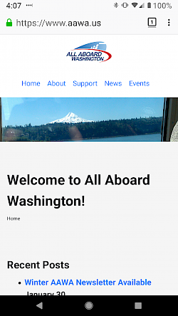
Absolutely! You will still be able to reach our website at allaboardwashington.org. But since that's such a long string to type, you will also be able to get to our website at aawa.us.
When will we start seeing the new logo?
We will start using the new logo as we create and update our materials. We'll be handing out flyers to legislators in Olympia shortly, and the next newsletter will feature the new design. And look for a completely new website soon.
But All Aboard Washington's mission remains the same: We are dedicated to promoting the improvement of a safe and robust passenger and freight rail transportation system in the state of Washington. We can make that happen, with your help!